
Test Prints: Pro Lab vs. Big Box Store/One Hour Lab

The results of the test print comparison are in! I figured this would be a timely post given that many folks are making photo prints for their holiday cards. As you can see below in the samples, there is certainly some variance in all of the photos. I took photos of the actual prints on the floor so while the difference in color, contrast and quality may not be as obvious as it is with the naked eye, you will see that there definitely is some difference in the photo comparisons.
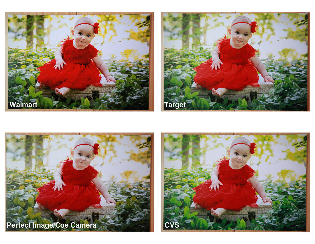
 Here we have four of the same image of little Annabelle on a suitcase in some bright green ground cover. The Walmart photo in my opinion is overly contrasty and saturated and the color tones seem to be off. The Target photo is similar, but a bit tamer in terms of contrast and a bit heavy on the green/yellow tones. The professional lab photo, printed at Perfect Image/Coe Camera, looks great in terms of contrast, though I find the tones to be a bit on the warm side. Surprisingly the CVS photo is probably the closest to accurate in the color realm of things; however I can see that the details of Annabelle's dress, specifically the roses and the folds of her skirt, are not as defined as the Perfect Image photo and the highlights look a bit blown out.
This is all a matter of personal opinion of course! If you were to hold the photos in your hand and compare them, I think you would find that the Perfect Image photo appears to be the best in overall quality, contrast and detail.
Now on to the black and white test of my sister Jennette:
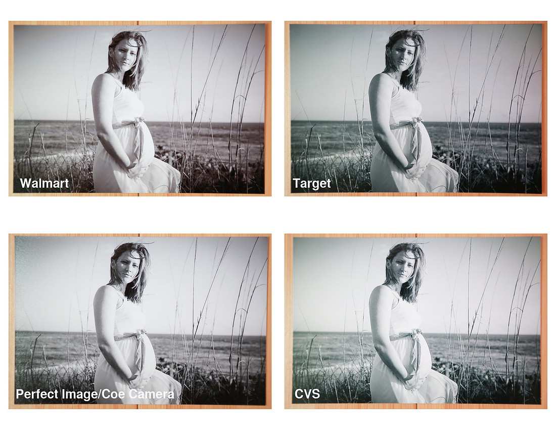 In comparing the black and white prints, I find the difference in tones to be what stands out to me the most with the Walmart photo being too purple/pink, the Target photo being too green/blue, the Perfect Image photo being just about right, and the CVS photo being too green. I prefer my black and white images to be a bit on the warm side, which is why I like the Perfect Image photo best. Once again in terms of contrast the Walmart and Target photos seem to be too dark. You can note that the shadow side of her face is darker in those two images compared to the Perfect Image and CVS photo.
I realize that many people now opt to order prints online instead of in store so perhaps I'll have to do a future post testing some of the most popular online print sites. If you'd like to see another print comparison, check out this post on Paint The Moon Blog, which affirms some of my conclusions.
I highly recommend supporting your local professional lab! If you paid for a professional photographer to take your photos and have the choice of where to make prints, why not do your photos and your photographer justice and get top quality prints? The cost difference is a matter of cents in my experience. I hope you found this comparison helpful! Happy printing!
Comments
Thanks! Great post :-)